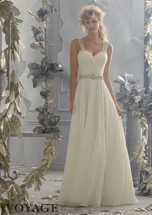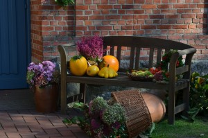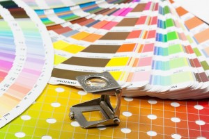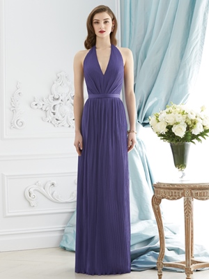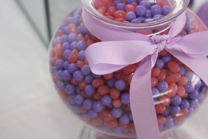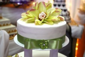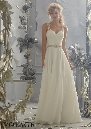
The wedding look you plan to have should center around the colors you choose for your wedding theme. You do not have to be an artist to create a beautiful wedding color palette, you can find inspiration everywhere and work with it to create the colors that will make your wedding venue what you always envisioned it to be.
If you are planning your wedding in fall, we have the perfect ideas to help you find your wedding colours. The three most important things to consider in order to find a winning combination are
- Consider the venue where you are to be married
- Please make the most of the season and exploit it to find a winning combination
- Consider the style of your wedding and decide on the color combinations.
Let us take a closer look at each of these points.
1.Consider the venue where you are to be married
Your wedding location plays a huge role, as it influences the effect of your color palette. The same color combination works differently in different settings, as the nature of lighting, disbursement of color and other aesthetic elements in the venue contribute to the overall effect. There is no specific order in which you have to work; you can either choose the venue first and then decide on your palette, or first choose your wedding color palette and then look for a suitable location.
Either method has it’s own pros and cons. In the first case, you will have to limit your color choices to those that will work well in the natural ambiance of your chosen venue. If it is a venue with signature décor attached to it or strong colors that stand out, you may have to come up with a combination that will blend in or complement the existing colors on site.
In the second case, you will have certain colors in mind already. In this scenario, you will have to choose a venue where these colors look good. This can limit your options, as not all venues will equally yield to all color palettes. The alternative is to switch to darker or lighter shades of what is on your palette and make a few necessary changes, so it works well in the setting.
2.Make the most of the season and exploit it to come up with a winning combination
Fall is a wonderful time to get married. Not only is it romantic, the weather is just perfect being neither too cold, nor warm. In fact, fall weddings are almost as attractive as spring weddings, if not better. A certain beauty is associated with the natural colors of fall, and it offers enough inspiration to help you plan a spectacular day. Deep, dark hues and rich indulgent colors add a luxurious touch to the natural environment, and these colors can render beautiful combinations at your wedding as well.
The color combinations mainly focus on shades of red, orange and purple with a refreshing mix of greens, yellows, blues and peaches thrown in. These are some of the signature colors we immediately associate with autumn. Weave your wedding color palette around them, and you cannot go wrong.
3.Consider the style of your wedding when you decide the color combinations
We know that some colors work better for certain wedding styles than others. While certain color combinations are inherently elegant and classic, others are joyful and fun. You have to find this balance when planning your colors for a unique wedding style. Here is a quick guide to choosing colors that work well together for different wedding types of weddings.
- Fresh and light colors like peach, pale yellow and glassy green look great in outdoor weddings. You can complement them with accent colors like pink or turquoise for a touch of drama. Other fall colors include maroon, gold, ochre, rust, brown and purple.
- For indoor weddings in formal settings, consider working with metallics like gold, silver or copper to add sophistication to your classic wedding palette. These metals work best with dark solid colors like navy and red, but you can also try combining them with lighter shades.
- White is a simple, but beautiful solution for almost any venue, and especially in those that have bright colors in the walls, décor or carpets. By using white in plenty, you can add pops of your favorite colors into the décor. These won’t clash with the existing ones as white will balance it out.
- Dusty colors should be used with caution in autumn weddings. Either mix them in with bright complementary colors or with dark shades. They can otherwise look faded and dull.
Every bride wishes to have a wedding that is unique, and the colors that you incorporate into your wedding palette play a huge role in achieving it. Here are the steps you should follow to find your color palette and fine-tune it, so it is just perfect for your big celebration.
1.Set up a wedding inspiration board
This is the first step towards planning your wedding palette. Refer to our article on creating your wedding inspiration board to find out what you need to get started. Once you have your setup ready, start collecting and pinning pictures that you like, to it. Slowly, you will observe a pattern emerging, and this will help you move on to the next step.
2.Choose one or two favorite colors
Take a look around you. Your wardrobe, favorite décor items and your inspiration board will help you choose one or two main colors to focus on. To make this easier, from your inspiration board, first eliminate those that you are not sure about. Next, pull out your favorite combinations so you can zero in on the common colors that you seem to be attracted to. Choose your favorite one or two bold colors from this list. Alternately, you may already have a color, flower or décor item that you must have. Then go with this as the starting point for your wedding color palette. The next step is to find the complementary colors that will set the mood for your wedding.
3.Choose complementary colors
Once you know the bold colors that you will use in your wedding palette, the next step is to find the complementing colors that will create the mood you want for your wedding. Refer to the color wheel for help. Two basic rules to find the best complementary colors are
- Choose from colors that are neighbors to your chosen main colors. These will help create an elegant combination, that is best suited for formal and classic styles
- Choose from colors that are directly opposite to the main colors your choose. These brighten up the main color in your palette, and should be your go-to choice for casual and fun styles.
You can experiment with light and dark shades of your chosen colors to find a combination that you love. Also add neutrals to balance it out appropriately. Consider adding a single metallic shade into your palette, if you want more sophistication or bling. Since each choice can drastically alter the ambiance, make sure to choose between gold, silver, copper or colored metallics with due care.
3.Decide where which color will be incorporated
This is a very detailed process. You will have to determine how your décor settings will be, the colors the bouquets should contain, how your table settings will feature your chosen colors and how your wedding party will reflect your color selection. Remember that you do not have to put in too much of the bold color for an impact. Sometimes, you can achieve more effect by adding pops of it as an accent color in your décor. Here are some factors to consider in this regard.
Bridesmaids dresses: If your bold color is an unusual shade, like berry or peach, that won’t flatter the skin tone of your bridesmaids, consider using the mix ‘n’ match trend when choosing their dresses. Read more about it here and here. Otherwise choose their dresses in the neutral colors in your palette and weave in the bold colors through accessories and flowers.
Wedding party: It is necessary to bring the looks of the bridesmaids and the groomsmen together and there are several ways to go about it. Make sure that the main colors of your palette are included in the right mix, without simply adding it in bulk. You could choose ties with a pattern that includes the main colors, but with taste. Or the boutonniere could have flowers in the main colors, while the rest of the outfit is simple.
Bouquets: If the main colors in your palette aren’t easily available in flowers, choose a neutral colored bouquet instead, and bring the color in through accessories like the ribbon. This is better than choosing the closest match, which can offset the intended effect entirely.
Decor: Be careful with how much color you add and where. Too many bold colors can tire the eyes, and your guests may feel the arrangement is too cluttered. So, balance out your décor with plenty of neutrals, and use your bold colors in small and properly balanced quantities. Add complementary colors when it is a huge display, so they are more effective.
Food: Keep the food colors simple, and rely on colorful stationery instead. While colorful desserts and few bright dishes may be appealing, too much of it may look unappetizing and artificial. Instead, add the color into the setting using colorful stationery for food labels and in centerpieces and napkins, to make it interesting.
Cake: Colorful cakes may look interesting. Nevertheless, not everyone finds it very palatable. The better option is to choose a design that has the right balance of the colors added through accessories like ribbons, flowers and other cake toppers. Autumn wedding cakes look best when decorated with berries, deep flowers and silky ribbons and soft glitter.
4.Tweak the details till you are satisfied
Be calm and composed, and approach the process of getting your colors right, one step at a time. It can become overwhelming, but dividing it into separate projects and handling only one aspect at a time is tricky. While inspiration boards are helpful, don’t depend on it for everything. Add your own touches to what you find, and work with what you have. You always have scope for enhancements, so add improvements and changes, so you have something new.
A very important thing to remember is that there is nothing called perfection. It is your satisfaction that matters. When you like what you see, stop and mentally note that you have done this right. This will allow you to relax and enjoy what you have, instead of wishing for something better. Get the opinions of your friends and family, or enlist their help with getting certain aspects right. Nevertheless, don’t lose track of the big picture. Recognize when it is time to stop obsessing with your color palette and focus on the other important things about your wedding.
Now that you are armed with all that you need to know about planning your color palette for your fall wedding, you are all set to begin. We suggest that you take a look at this color guide on Magnetstreet for some winning color combinations that work beautifully in autumn. They have done a wonderful job of sorting out each palette according to the mood the combination creates. So, whether you want a tangy vibe or a poetic wedding combination, you have the starting point to build your palette. You can also visit Wedding Paper Divas here for some more color combinations that scream autumn!
To find bridesmaids’ dresses and choose invitations, décor or cakes in any of these color palettes, visit us online at Best for Bride. Use our wedding services to make your dream wedding colours come to life.


